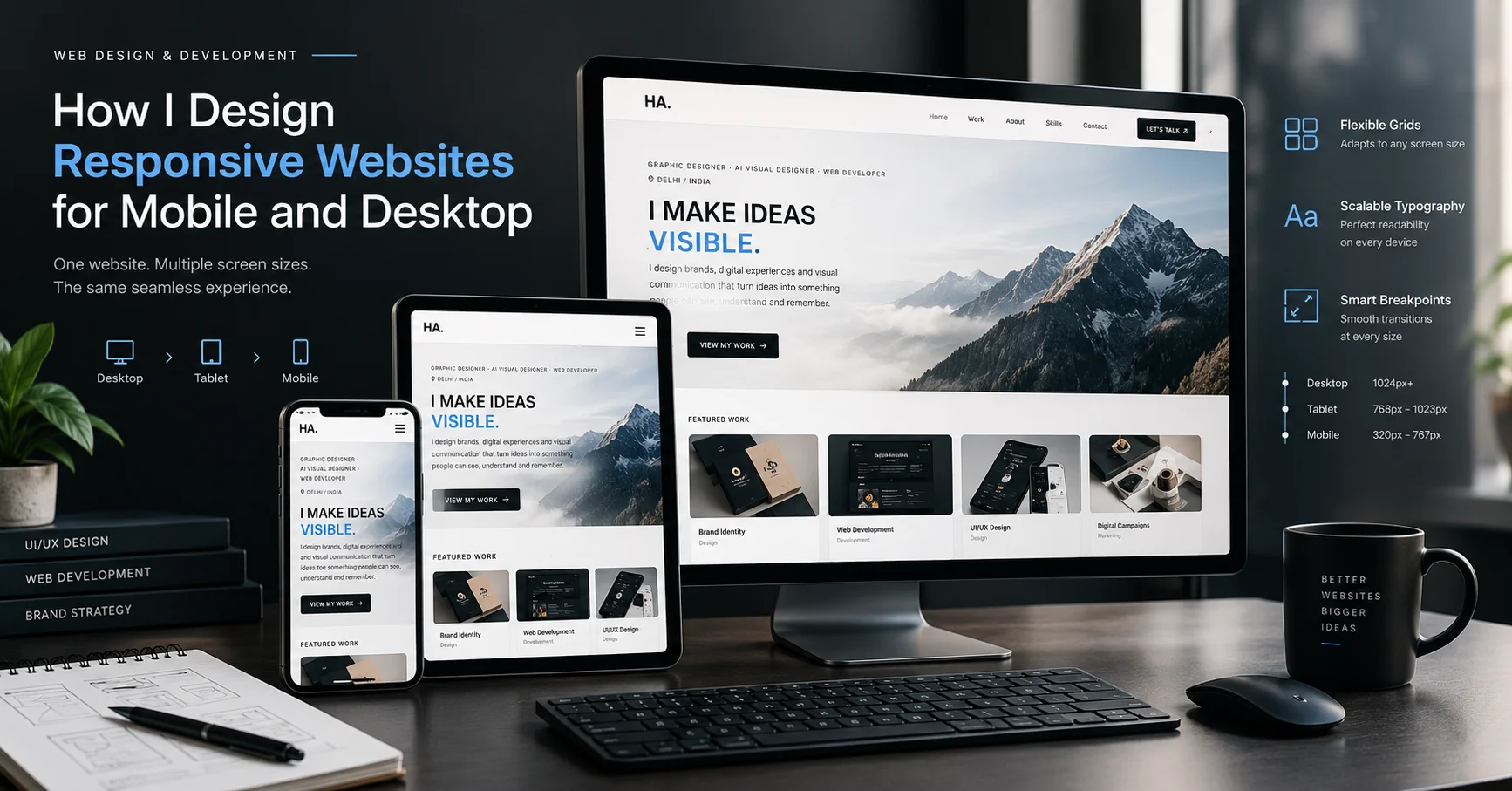
How I Design Responsive Websites for Mobile and Desktop
A practical look at how I design responsive websites that work across mobile, tablet and desktop, from mobile-first layouts and breakpoints to typography, navigation and touch interactions.
- Author
- Hasnain Ansari
- Published
- Reading time
- 8 min read
Introduction
A website can look great on a desktop and still provide a frustrating experience on a phone.
That is one of the biggest things I consider when designing websites.
Today, people access websites across a wide range of devices and screen sizes. A visitor might open a website on a large desktop monitor in the morning, check it again on a tablet and later browse it from a phone.
The website needs to work in all of those situations.
For me, responsive web design isn't simply about making a desktop layout smaller.
It's about designing an interface that can adapt to different screens while keeping the experience clear and usable.
My approach usually combines:
Mobile-first thinking + flexible layouts + intentional breakpoints + responsive typography + touch-friendly interactions + continuous testing.
Here's how I approach it.
What Responsive Web Design Actually Means
Responsive web design means creating a website that adapts its layout and interface to the available screen size.
Instead of creating completely separate websites for desktop and mobile, the same website can adjust its structure based on the device and viewport.
For example, a desktop page might display:
Navigation → Hero → Two-column content → Three feature cards
On a smaller screen, that could become:
Mobile navigation → Hero → Stacked content → Single-column cards
The content doesn't necessarily change.
The way it is presented changes.
That's what makes responsive design more than simply reducing the size of a desktop website.
I Start With Mobile-First Thinking
When I design a responsive website, I often think about the mobile experience early in the process.
Mobile screens have less available space, so they force me to make decisions about what is actually important.
I need to consider:
- What should appear first?
- What can be simplified?
- Which navigation items are essential?
- How much text should be visible?
- How large should buttons be?
- How should images be cropped?
- Which elements can be stacked?
- What should happen when the screen becomes smaller?
This doesn't mean the desktop experience becomes less important.
It means the core experience is established before additional space is introduced.
Once the mobile structure works, I can expand it for larger screens.
Designing Flexible Layouts
A responsive website shouldn't depend on fixed dimensions everywhere.
I prefer layouts that can adapt to the available space.
This can involve:
- Flexible containers
- CSS Grid
- Flexbox
- Relative units
- Maximum content widths
- Fluid spacing
- Responsive images
- Flexible columns
For example, instead of creating a section that is designed to be exactly one fixed width, I can use a responsive container with a maximum width.
This allows the content to remain readable on large displays while still fitting smaller screens.
The objective is to create a layout that responds naturally instead of breaking at unexpected screen sizes.
Breakpoints Should Have a Purpose
Breakpoints are an important part of responsive web design.
They determine when a layout should change as the available screen width changes.
But I don't think breakpoints should simply be chosen because they are commonly used values.
The design itself should determine when a breakpoint is needed.
For example, if a navigation bar becomes crowded at a certain width, that's a good reason to change the navigation.
If three cards become too narrow to read comfortably, that's a reason to change the grid.
If a heading wraps awkwardly, the typography or layout may need to adapt.
In other words:
Design problems should determine breakpoints, not the other way around.
Designing Responsive Navigation
Navigation is one of the areas where the difference between desktop and mobile can become obvious.
A desktop website may have enough space for:
Logo | About | Services | Work | Blog | Contact
Trying to keep exactly the same navigation on a small phone can create a poor experience.
On mobile, I may use a compact navigation pattern such as a menu button or simplified navigation.
The important thing is that users can still understand:
- Where they are
- Where they can go
- How to return
- How to access important pages
Responsive navigation should reduce complexity without hiding essential information.
Typography Needs to Adapt Too
Responsive design isn't only about the layout.
Typography also needs to respond to different screen sizes.
A large desktop heading might look excellent on a wide screen but become unnecessarily large on a phone.
I consider:
- Font size
- Line height
- Letter spacing
- Text width
- Heading hierarchy
- Paragraph length
- Wrapping behavior
Readable typography is especially important on mobile because the viewing distance and available screen width are different.
I also avoid making paragraphs span the entire width of a large desktop screen.
A controlled text width usually makes long-form content easier to read.
Images Need Responsive Treatment
Large images can create problems if they aren't handled correctly.
They can cause:
- Slow loading
- Layout shifts
- Cropping problems
- Excessive bandwidth usage
- Poor mobile experiences
I consider both the visual and technical side of responsive images.
An image may need a different crop or aspect ratio depending on the available space.
For example, a wide hero image that works on desktop might need a more vertical composition on mobile.
The goal is not simply to shrink the image.
It's to preserve the important visual information while adapting it to the available space.
Designing for Touch Interactions
Desktop users have a mouse or trackpad.
Mobile users interact primarily through touch.
That changes how I think about interface elements.
Buttons, links and interactive controls need enough space to be comfortably tapped.
I pay attention to:
- Button size
- Spacing between interactive elements
- Navigation controls
- Form inputs
- Swipe or touch interactions
- Hover-dependent functionality
A desktop interface might use a subtle hover effect to communicate interaction.
That same interaction can't be the only way to understand something on a touchscreen.
The interface needs to work without relying on hover.
Hover Effects Aren't Enough
Hover states are useful on desktop, but they don't translate directly to mobile.
For example, a card might reveal additional information when someone moves a cursor over it.
On a phone, there may be no equivalent hover interaction.
So when designing responsive interfaces, I ask:
What happens if there is no mouse?
This simple question can prevent a lot of mobile usability problems.
Important information shouldn't depend entirely on an interaction that only exists on desktop.
Responsive Forms
Forms also need special attention on smaller screens.
A form that uses several columns on desktop may need to become a single-column layout on mobile.
I consider:
- Input width
- Label placement
- Font size
- Button size
- Field spacing
- Error messages
- Keyboard behavior
The goal is to reduce friction.
If someone is filling out a contact form from a phone, they shouldn't have to constantly zoom, scroll sideways or struggle to tap small controls.
Testing Across Different Screen Sizes
One of the most important parts of responsive web design is testing.
I don't assume that a design will work simply because it looks good in one browser window.
I check different viewport sizes and look for problems such as:
- Text wrapping
- Overflow
- Broken grids
- Overlapping elements
- Navigation issues
- Incorrect image crops
- Small buttons
- Excessive spacing
- Unexpected horizontal scrolling
I also resize the browser instead of testing only a few predefined device sizes.
This can reveal problems between common breakpoints.
Responsive Design Is More Than Device Sizes
It's tempting to think about responsive design as:
Desktop → Tablet → Mobile
But real users don't necessarily fit into three fixed categories.
There are phones of different sizes, tablets with different orientations, laptops with different resolutions and large desktop monitors.
That's why I prefer thinking about responsive layouts as a continuous system.
The design should respond to the available space rather than being built exclusively around specific devices.
Performance Is Part of Responsive UX
Responsive design and website performance are closely connected.
Mobile users may be using slower networks or less powerful devices.
A visually impressive website can become frustrating if it requires huge images, unnecessary scripts and heavy animations before the user can interact with it.
I consider performance alongside design by looking at things such as:
- Image optimization
- Lazy loading
- Font loading
- JavaScript usage
- Animation performance
- Asset sizes
- Layout stability
A responsive website should not only fit the screen.
It should also respond quickly.
Accessibility Matters on Every Screen
Responsive design should also consider accessibility.
A website needs to remain usable for people with different needs and different ways of interacting with digital interfaces.
Some areas I consider include:
- Sufficient color contrast
- Readable text
- Clear focus states
- Keyboard navigation
- Semantic HTML
- Descriptive labels
- Accessible interactive elements
These considerations often improve the experience for everyone, not only users who specifically rely on accessibility features.
My Responsive Web Design Workflow
My process can be summarized like this:
1. Define the content hierarchy
Decide what information is most important.
2. Start with the core mobile experience
Create a clear structure for smaller screens.
3. Build the flexible layout
Use grids, flexible containers and responsive sizing.
4. Expand for larger screens
Introduce additional columns, spacing and visual elements where appropriate.
5. Define meaningful breakpoints
Change the layout when the content needs it.
6. Adapt typography and imagery
Make text and visual elements work across different sizes.
7. Check touch interactions
Make buttons, forms and navigation comfortable to use on mobile.
8. Test continuously
Resize, test and refine rather than waiting until the end.
9. Optimize performance
Keep the responsive experience fast and stable.
Common Responsive Design Mistakes I Try to Avoid
Some problems appear repeatedly in responsive websites.
Designing Only for Desktop
Starting with a desktop layout and simply shrinking it can create a poor mobile experience.
Using Too Many Fixed Widths
Fixed dimensions can cause overflow and unnecessary horizontal scrolling.
Making Mobile an Afterthought
Mobile users shouldn't receive a simplified version of a desktop experience that was never designed for their screen.
Making Text Too Small
Trying to fit too much information onto a mobile screen can make content difficult to read.
Using Tiny Buttons
Interactive elements need enough space for comfortable touch interaction.
Depending on Hover
Important information or functionality shouldn't require a mouse hover.
Ignoring Performance
A responsive layout doesn't help much if the page takes too long to load.
Responsive Design and User Experience
For me, responsive design is ultimately a UX problem.
The technical implementation matters, but the bigger question is:
Can someone use the website comfortably regardless of the device they're using?
A responsive website should make the experience feel natural.
Users shouldn't have to think about the screen size.
They should simply be able to navigate, read, interact and complete their intended task.
That's the real goal.
Final Thoughts
Designing a responsive website isn't about creating one desktop design and making everything smaller.
It's about creating a flexible system that adapts to different environments.
My approach combines:
Mobile-first thinking + flexible layouts + purposeful breakpoints + responsive typography + touch-friendly interactions + performance + continuous testing.
The best responsive websites don't make users think about responsiveness.
They simply work.
Whether someone visits from a phone in Delhi, a laptop at home or a large desktop monitor, the experience should remain clear, functional and consistent.
For me, that's what good responsive web design should achieve.
About the Author
Hasnain Ansari is a Graphic Designer, AI Visual Designer and Web Developer based in Delhi, India. His work combines UI/UX design, web development, graphic design and AI-assisted creative workflows to create purposeful digital experiences.
He works on responsive websites, landing pages, digital interfaces and creative projects, with a focus on combining visual design with practical technology.
Explore the portfolio →
About Me →
/about